
Introduction
Maps are far more than mere tools for direction; they are profound cultural artifacts, scientific instruments, and storytelling mediums that have shaped human civilization for millennia. From ancient clay tablets depicting Babylonian territories to real-time digital renderings of global traffic patterns, maps translate the complexities of space into accessible visual narratives. They influence geopolitics, drive exploration, and underpin daily logistics—yet their multifaceted roles are often overlooked. This article delves into the intricate world of cartography, exploring its historical evolution, technological advancements, and indispensable societal functions. By examining how maps encode both objective geography and subjective perspectives, we uncover their power to define realities, manipulate perceptions, and guide humanity’s relationship with the planet.
The Historical Evolution of Cartography
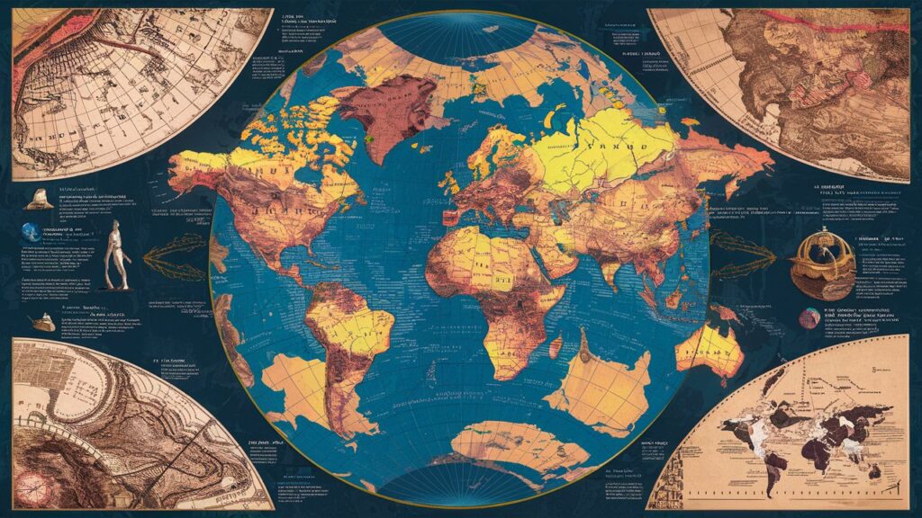
Cartography’s journey began over 5,000 years ago with rudimentary sketches on cave walls and clay tablets, evolving through the contributions of ancient Greek scholars like Ptolemy, whose Geographia laid groundwork for systematic projection methods. Medieval mappae mundi fused spiritual symbolism with earthly geography, prioritizing religious ideology over spatial accuracy, while the Age of Exploration spurred revolutionary advances as navigators like Mercator developed projections enabling transoceanic voyages. The 19th-century Ordnance Surveys epitomized precision in national mapping, driven by military and colonial ambitions. Each era’s maps reveal not just geographic knowledge but also cultural priorities—whether mythic, imperial, or scientific. This historical tapestry underscores maps as evolving dialogues between human ingenuity and the terrains they seek to conquer or comprehend.
Types of Maps and Their Specialized Functions
Maps serve diverse purposes, classified by their design and intent. Topographic maps utilize contour lines and shading to render three-dimensional landscapes onto two-dimensional surfaces, essential for hikers, geologists, and urban planners. Political maps demarcate borders, capitals, and territories, visualizing sovereignty and administrative boundaries critical for diplomacy and education. Thematic maps—such as climate, population density, or economic activity charts—transform statistical data into spatial narratives, revealing patterns invisible in raw numbers. Navigation charts, whether nautical or aeronautical, prioritize real-time usability with symbols for hazards, routes, and infrastructure. Meanwhile, digital interactive maps like Google Earth integrate layers of real-time data, from traffic flows to air quality, democratizing dynamic spatial analysis. Each type exemplifies cartography’s adaptability in translating abstract concepts into tangible visual tools.
Geographic Information Systems (GIS): The Digital Cartography Revolution
Geographic Information Systems (GIS) represent the apex of modern cartography, merging database technology with spatial visualization to analyze relationships across geographic datasets. Unlike static paper maps, GIS platforms like ArcGIS or QGIS process layers of information—satellite imagery, demographic statistics, environmental sensors—to generate dynamic models for decision-making. Urban planners deploy GIS to optimize public transport routes by overlaying population density with existing infrastructure, while ecologists model deforestation impacts by comparing historical vegetation layers with real-time deforestation alerts. The system’s core strength lies in spatial analysis: calculating flood risks through elevation data, predicting disease spread via mobility patterns, or identifying retail locations through consumer behavior mapping. GIS transforms maps from passive references into predictive engines, embedding cartography into the backbone of contemporary governance and industry.
Cartographic Design Principles: Balancing Art and Science
Effective mapmaking hinges on harmonizing aesthetic clarity with technical rigor. Scale dictates the level of detail possible, influencing symbol density and legibility—city maps omit mountains to highlight streets, while continental maps simplify coastlines. Projection choices, whether Mercator’s navigational aid or Peters’ area-accurate alternative, inherently distort shape, distance, or area, revealing cartographers’ prioritizations. Color theory guides thematic clarity: blue gradients for depth in bathymetric charts, red-to-green spectrums for temperature variations. Typography strategically labels features without cluttering space, while symbol standardization (e.g., dotted lines for borders or crossed anchors for shipwrecks) ensures universal comprehension. These principles confront ethical dilemmas: how color choices might politicize disputed borders or how selective data inclusion can marginalize communities. Thus, cartography is both science and rhetoric, wielding visual language to inform or persuade.
Societal Impacts: Maps as Instruments of Power and Advocacy
Maps inherently exercise influence, legitimizing ownership, directing resources, and shaping collective consciousness. Colonial powers used maps to assert territorial claims, erasing indigenous toponyms to impose colonial names—a practice countered today by projects like Decolonial Atlas, which revitalizes native place names. Urban zoning maps historically enforced segregation, while modern participatory GIS empowers marginalized groups to map informal settlements, pressuring governments for utilities and land rights. In disaster response, platforms like OpenStreetMap mobilize volunteers to chart crisis zones in hours, guiding aid delivery. Meanwhile, propaganda maps manipulate perception; during the Cold War, distorted projections amplified ideological threats. These examples underscore cartography’s dual potential: to entrench inequality or democratize knowledge, making critical map literacy a civic necessity.
Future Frontiers: AI, Real-Time Data, and Immersive Cartography
The future of mapping is being reshaped by artificial intelligence, real-time data streams, and immersive technologies. AI algorithms process satellite imagery to autonomously update road networks or detect illegal mining, while machine learning predicts urban sprawl by analyzing decades of land-use changes. Real-time maps integrate IoT sensors—tracking everything from air pollution to crowd movements—enabling responsive smart cities. Yet these innovations raise challenges: data privacy concerns, algorithmic bias in automated labeling, and the digital divide excluding communities from next-gen tools. Cartography’s next evolution demands ethical frameworks as robust as its technologies.
Conclusion
Maps remain indispensable in our quest to navigate, understand, and coexist within an increasingly complex world. They are mirrors reflecting humanity’s aspirations and biases, bridges connecting data to action, and canvases for reimagining our future. As we embrace AI-driven cartography and participatory mapping movements, the power shifts from elite mapmakers to diverse global communities—each contributing to a more inclusive spatial narrative. In an age of climate crises and geopolitical strife, maps transcend their utilitarian roots, emerging as tools for empathy, advocacy, and planetary stewardship.
Frequently Asked Questions (FAQs)
Q1: What’s the difference between GPS and GIS?
GPS (Global Positioning System) is a satellite-based navigation tool that pinpoints exact locations on Earth. GIS (Geographic Information System) is a broader framework for capturing, analyzing, and visualizing spatial data. While GPS provides coordinates, GIS interprets those coordinates alongside layers of contextual data (e.g., soil quality, population, infrastructure) to solve complex spatial problems.
Q2: Why do maps distort the size of countries?
All flat maps distort because projecting a spherical Earth onto a 2D surface requires mathematical compromises. The Mercator projection, for example, exaggerates polar regions (making Greenland appear larger than Africa) to preserve navigational angles. Alternatives like the Robinson or Mollweide projections prioritize area accuracy but bend shapes.
Q3: How do modern maps stay updated?
Satellite/aerial imagery, crowdsourced platforms (e.g., OpenStreetMap), government databases, and AI-driven change detection algorithms collaborate to update maps. Companies like Google combine Street View cars, user reports, and machine learning to refine details in near real-time.
Q4: Can maps be biased?
Absolutely. Maps reflect creators’ perspectives through choices like centerlines (Eurocentric maps vs. Pacific-centered), border delineations, or feature inclusions. Historically, maps amplified colonial power; today, biases may manifest in algorithmic data prioritization or omission of marginalized areas.
Q5: What is “critical cartography”?
Critical cartography examines maps as social and political instruments rather than neutral artifacts. It questions how maps reinforce power structures, advocates for community-led mapping to challenge dominant narratives, and promotes ethical practices in representation.
Q6: How do topographic maps represent elevation?
They use contour lines—curves connecting points of equal elevation. Close lines indicate steep slopes; spaced lines suggest gentle terrain. Colors and shading enhance readability, with blue for water and green/brown for land relief.
Q7: Are paper maps obsolete?
Not entirely. While digital maps dominate for real-time navigation, paper maps remain vital in remote areas without connectivity, for educational purposes, artistic expression, and as durable backups during emergencies when electronic systems fail.